Visualising where cancer research funding is going
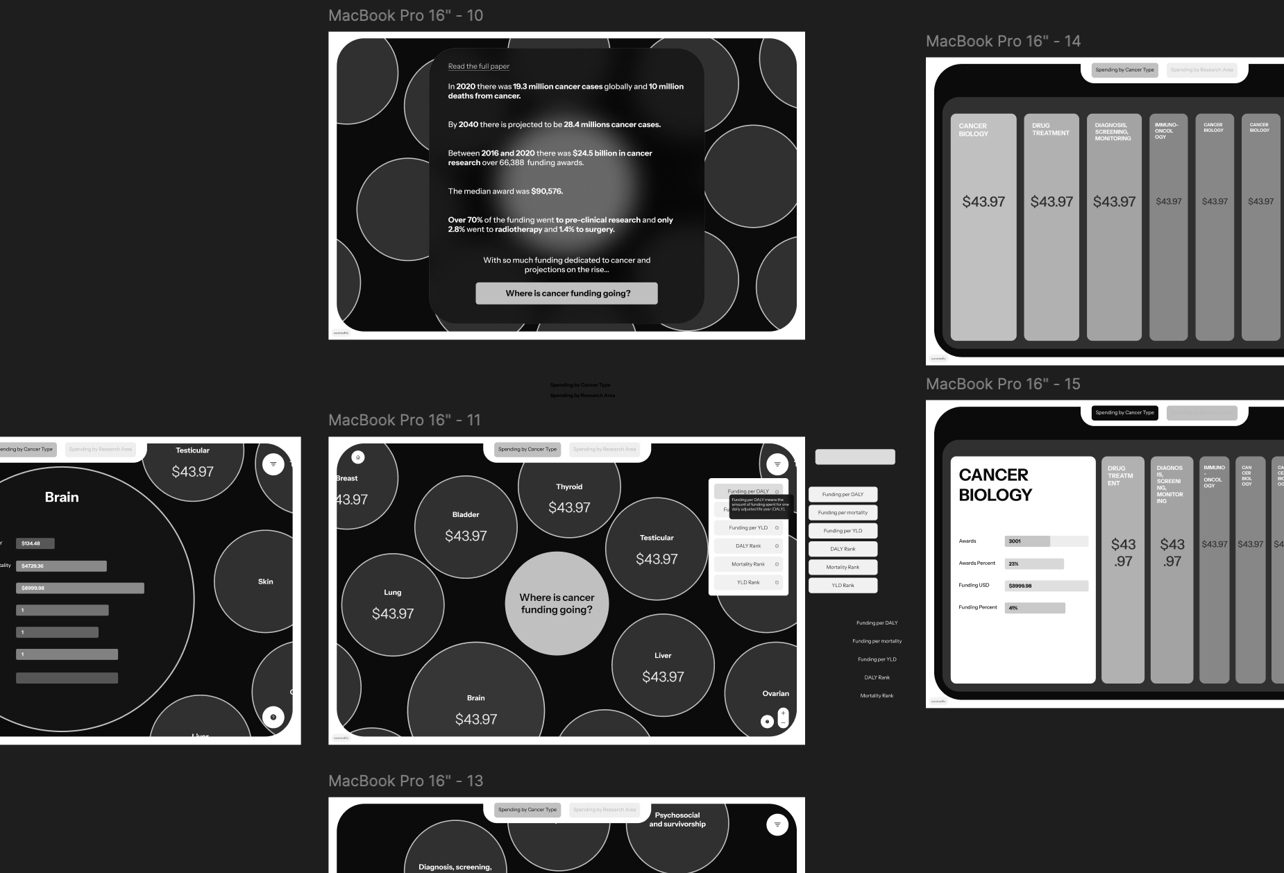
There were 19.3 million Cancer cases globally in 2020 and 10 million deaths from Cancer. For several decades many billions of dollars have been raised and donated towards fighting Cancer, however with projections on the rise we seeked to understand where cancer research funding was being spent. The basis of this data tool was a Lancet Paper that we analysed and extracted data from.
Capabilities
Custom Python pipeline, Data analysis, full tool UI/UX design, back-end and front-end development including app data pipeline

Challenges
Analysing a large academic PDF paper to accurately extract and cluster a large amount of insights.
Curating a clear data driven narrative in a coherent and interactive manner that enables people to explore a otherwise confusing dataset.
Outcomes
A completely custom tool allowing users to explore where cancer research is going.
A custom Python pipeline allowing for extraction of insights from a infinite numbers of papers.
We used a reknowed a large Lancet paper (click here to view paper) which focused on global cancer research funding and where it is spent. We developed a custom Python pipeline that ran a thematic analysis and extracted insights into topic relavant tabular data files. We went through a validation and cleaning process with all the data files to prepare the data to be used in the tool.
To develop the narrative we could use as the foundation of the designs we analysed all the data and started to constructing the narative by pulling out interesting insights and themes for example over 70% of the funding went to pre-clinical research and only 2.8% went to radiotherapy and 1.4% to surgery. We decided that the most interesting and insightful perspective of the data was to view it through the lens of the type of Cancer, the research theme and research area.

Once we had a clear idea of the narrative we started to work on the UX and UI of the tool. A key consideration was around the information architecture and how users would be able to ingest and synthesis a large amount of information without being overwhelming we worked on many variations until reaching a working solutions. The other important factor was renaming technical labels so they were clear to users and removed any unneccesary jargon.

To develop the front-end of the tool we used a combination of SSR, React and various motion and animation libaries to produce a smooth and performant experience that allows users to clearly see where Cancer funding is spent by Cancer type, research theme and research area with the ability to filter by various factors (Funding per mortality, Funding per YLD, Rank, etc).